
What is meta viewport?
Viewport is the user’s visible area of a web page. This is the part you can see from your device or monitor. It is located on the <head> tag of the HTML.
What does a viewport meta tag look like?
<meta name="viewport" content="width=device-width, initial-scale=1">
What is the purpose of a viewport?
A viewport makes sure a site display well on all device (mobile phones, tablets, computers, and even larger screens). In a nutshell, viewport plays a significant role in designing responsive and mobile-friendly websites.
Why is viewport important?
Take a look at these two website examples to visually see why:
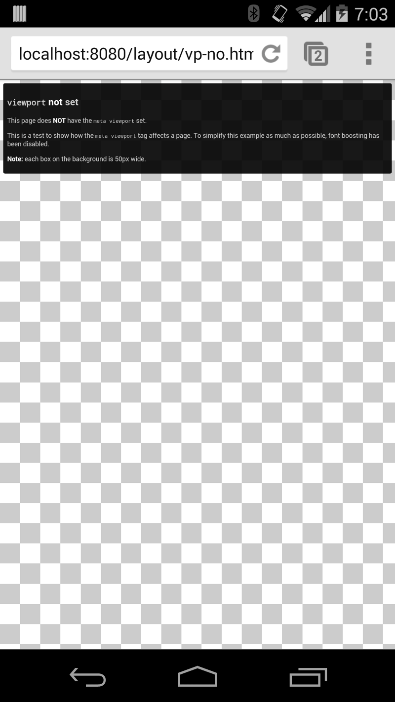
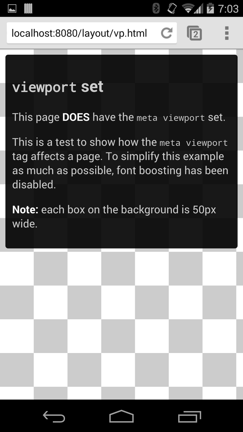
The viewport meta tag is an important component of responsive web design that may also provide some performance benefits.
Mobile browsers render pages in a virtual "window" (the viewport), which is typically broader than the screen, eliminating the need to cram every page layout into a tiny window (which would break many non-mobile-optimized sites). Users can pan and zoom to view various regions of the page.
Impact of mobile viewport in SEO
Google recommends including a meta viewport in the head of the document. It even goes further to outlines some basic SEO guidelines on responsive web design. This shows how crucial it is to configure the mobile viewport of your site today.
Here’s what Google had to say about viewport:
“Pages optimized for a variety of devices must include a meta viewport tag in the head of the document. A meta viewport tag gives the browser instructions on how to control the page’s dimensions and scaling.”
Viewport best practices
How do you make sure your website is displayed in a mobile-friendly way? Here is what you need to do:
- Circumvent using absolute width values in your CSS, such as px, pt, cm, mm, in, or pc. Absolute values can result in the elements of your website loading wider than your viewport allows. Instead, use relative width values like ch, rem, vw, em, ex, vh vmin, %, and vmax.
- Avoid rendering your website to a specific width. Widths vary from one device to another. For example, the width of a smartphone is different from that of a laptop.
How to manually test your website viewport readiness and responsiveness
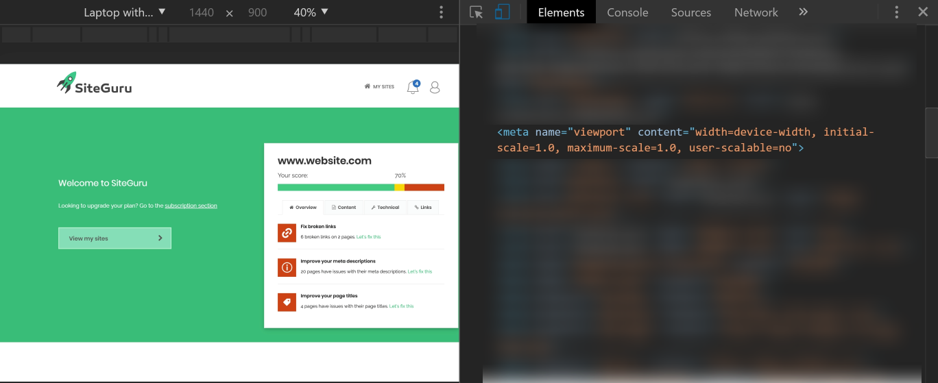
The easiest way to see how your website displays on different devices is to right click and select the "Inspect Element" of your site:

On the right side, look for <head></head> section of the elements, you can find the viewport there:
To view how your website appears based on the various tools by Google, test it with your own device or by using Chrome “Inspect Element". Note that the Chrome browser does not let you use pinch-to-zoom or drag your screen left to right.
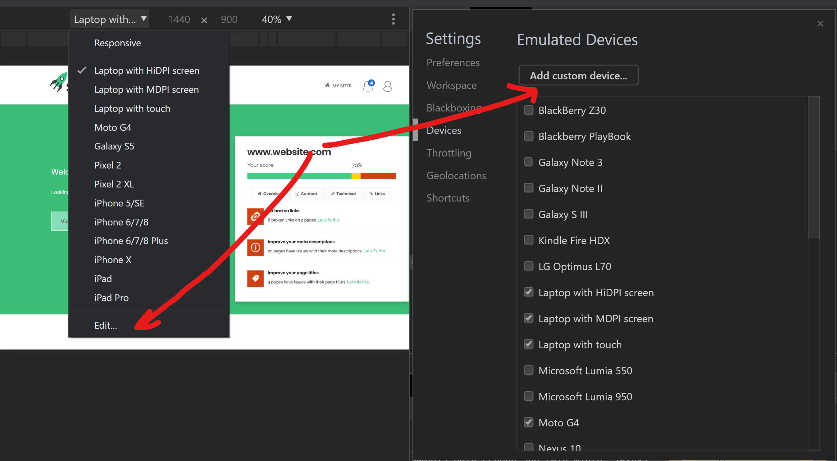
You can select popular devices and see if each device is being displayed well. To view more devices, go to “Audience,” “Mobile,” and then “Devices.”
Here you can find the most popular devices being used to access your website. If those devices are not based on the most current and popular devices out there, locate the device you are looking for by name. You can also add custom devices based on the pixel ratio.
Here is how to add a custom device:
Select the device section and click on "Edit,” and then “Add custom device.” Now enter the device name, height, width, user agent string, and device pixel ratio.
How to configure the mobile viewport for your website
Do the following to configure the mobile viewport for your website.
- Dynamic design configuration
In case you have a dynamic design, you will have to create an entire separate page to serve different versions and tell each user agent what to access from the same URL. You need to use the Vary HTTP header on the page. Have a look at the example below for more info on how to create that request:
GET /page-1 HTTP/1.1
Host: www.example.com
(...rest of HTTP request headers...)
HTTP/1.1 200 OK
Content-Type: text/html
Vary: User-Agent
Content-Length: 5710
(... rest of HTTP response headers...)
You can learn more about the dynamic design configuration.
- Separate URLs configuration
You will need more development resources with the approach. Basically, you will have to build a new website from scratch and host it on a subdomain like www.m.example.com. That is not all. You will have to build annotations for mobile www.m.example.com and desktop www.m.example.com devices to help search engines understand separate mobile URLs.
Have a look at this example to learn how to annotate each URL
On the mobile page (http://m.example.com/page-1)
<link rel="canonical" href="http://www.example.com/page-1">
On the desktop page (http://www.example.com/page-1):
<link rel="alternate" media="only screen and (max-width: 640px)" href="http://m.example.com/page-1">
This rel=”canonical” tag on the mobile URL pointing to the desktop page is required. Sitemap annotation needs to include the following:
<?xml version="1.0" encoding="UTF-8"?>
<urlset xmlns="http://www.sitemaps.org/schemas/sitemap/0.9"
xmlns:xhtml="http://www.w3.org/1999/xhtml">
<URL>
<loc>http://www.example.com/page-1/</loc>
<xhtml:link
rel="alternate"
media="only screen and (max-width: 640px)"
href="http://m.example.com/page-1" />
</url>
</urlset>
Learn more here about separate URL configuration.
- Responsive design configuration
This is the easiest way to create a mobile-friendly website. In fact, Google recommends this approach.
How do you set a viewport?
Here is what you need to do:
Add the following at the head of the HTML to give the browser instructions on how to control the page’s scaling and dimensions on different devices.
<meta name="viewport" content="width=device-width, initial-scale=1">
The initial-scale=1.0 sets the initial zoom level when the browser first loads the page. Once you set the page’s viewport, you can proceed to size the page’s content.
